Funded by the Foreign, Commonwealth & Development Office (FCDO), UK Aid Direct supported small and medium sized civil society organisations (CSOs), based in the UK and overseas, to achieve sustained poverty reduction and the United Nations's Global Goals.
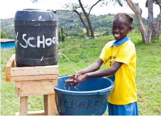
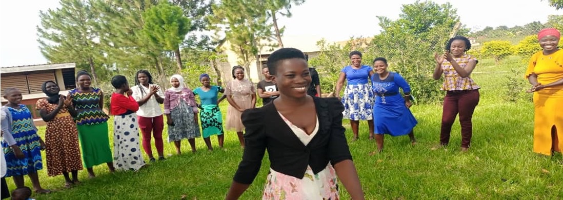
The fund was flexible, adaptive and demand-led, responding to UK government priorities. Project themes included conflict prevention, disability inclusion, education, ending modern day slavery, health, livelihoods, nutrition, WASH and women's empowerment.
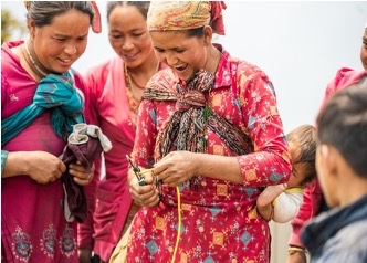
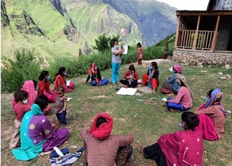
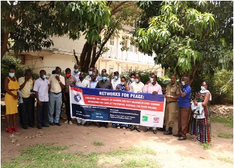
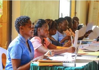
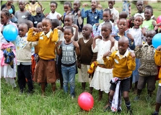
All projects have now ended, and this website will no longer be updated. We would like to take this opportunity to thank all grant holders and civil society organisations involved in the programme. We are proud that UK Aid Direct has been able to reach nearly 9.8 million vulnerable and marginalised women, children and men, through 196 grants since the start of the fund in 2014, and through projects delivered across 39 countries.
For any further information on UK Aid Direct, we recommend visiting gov.uk's page on the UK Aid Direct fund.